Report generation
You can create Graphical time series reports based on event filters. E.g.:
Example
Identify the log messages
Assuming you're having log messages like:
MON CPUS info CPU usage in interval : 42.1% cpu since boot : 21.0% Total thread cpu load : 15.5%
and you do want to create a graph of the three values.
Define the filter
Open Preferences: Open Settings (JSON) and add a filter:
"dlt-logs.filters":[
  {
      "type": 3,
      "apid": "MON",
      "ctid": "CPUS",
      "payloadRegex": "CPU usage in interval : (?<cpu_usage>.*)% cpu since boot : (?<cpu_since_boot>.*)% Total thread cpu load : (?<thread_cpu_load>.*)%"
  }
]
The filter will be used on all messages independent whether the messages are hidden by other view-filters (positive or negative).
Exceptions are load-time filters that are already applied at load time of the DLT file and did remove the messages completely.
Open a dlt file and generate the report
To open a report simply open a DLT log file and press the report icon in the filter:

Zooming in a report
To zoom in/out simply there are two different modes:
In default / non drag mode simply
- use the mouse wheel (or e.g. two finger up/down gestures on macOS touchpads),
- click and drag the report to scroll left/right.
In "drag mode" - after pressing the Enable drag mode button - simply
- select the time range by press and hold the mouse button at start time and drag to end time and release there.
You can always press the Reset zoom button to get back to default view.
Ignore lifecycle start range
The Toggle lifecycle start button allows you to hide the start of the report with no data points.
In general the report covers the timeframe from all lifecycles.
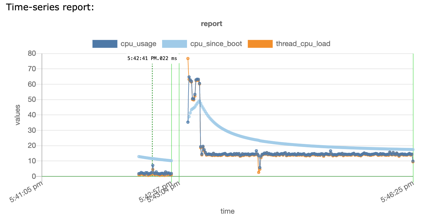
E.g. in the picture from the example above the first lifecycle starts at 5:41:05pm but the first logs start only at 5:42:29pm. The default view is useful to e.g. understood how the lifecycle was already running before the logs have been captured or exported.
With the Toggle lifecycle start button you can toggle the view to hide/show the timeframe where no logs are available for.
Show lifecycle annotations
The LC annotations checkbox allows you to hide/show the lifecycle horizontal lines that show the start, end, ECU name and lifecycle number.
The setting is persisted in the extension globalState.
Show the current selected time
The report highlights the selected time - i.e. the time that corresponds to the selected line in the DLT file with a vertical green dotted line, e.g. here at 5:42:41 PM and 22ms:

If you move the cursor in the dlt log window the selected time will move accordingly.
Reports use your current selected theme colors, here e.g. Light+.
Show the times for all search results
You can as well select multiple lines e.g. from search results:
- Windows
- macOS
- Linux
to select all occurrences of the search text, e.g:
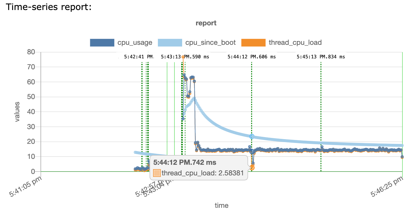
The picture shows as well the tooltip window that appears on hovering over a data point.
Jump to DLT log message around a selected data point
If you click on a data point in the report the DLT log window tries to scroll the top to the next message that occured around the time from the data point.
Details
You can define event filters (type: 3), add normal filters like ecu, apid, ctid and use a payloadRegex that captures either one value or even multiple values with named capture groups (?<series_name>.*).
The amount of log messages processed for a report is limited to avoid long processing times. The default limit is 1 mio logs but you can change
it with the config setting dlt-logs.maxReportLogs.
A warning will be shown in the report if you hit the limit.
Capture group names and types
By default all captures needs will be parsed as float numbers. You can change that behaviour by prefixing the capure name with STATE_ or INT_ (see below).
| value name | expected type | comment |
|---|---|---|
| STATE_* | enum | Used to represent distinct states. Will use 2nd axix. Can be ints or strings. See reportOptions/valueMap on how to map to better readable names. |
| EVENT_* | float | will use scatter/event - dot based and not line based chart. |
| TL_* | enum | Used to create data for timeline / swimlane charts. Details see TL format details. If TL_ datapoints are used the timeline chart will appear as well. |
| INT_* | int | will use parseInt(). Can be used if e.g. hex values should be converted. |
| other | float | will use parseFloat(). |
STATE_ and EVENT_ logically exclude each other as you do either want to draw a state diagram or a scatter/point diagram.
INT_ logically would fit as well for STATE_ or EVENT˜_ but this can't be encoded using the value name. So e.g. if you need to convert hex values this is possible using a conversionFunction that converts the value already. E.g.
return { 'STATE_foo': Number.parseInt(matches[1])};
Grid lines for lifecycle start/ends are automatically added. The lifecycle starts are using a solid line and the ends are drawn with a dashed line. Different colors are used per ECU (green for the ECU with the most messages, blueish for the 2nd ECU, grey for 3rd).
Mapping values to names
It's often desirable to map values to names for to ease readability. E.g.
| value | name |
|---|---|
| 0 | low |
| 1 | high |
| 255 | unknown |
An easy way is to define a valueMap by adding a it to the reportOptionsobject for the filter:
{
  "type": 3,
  "apid": "...",
  "ctid": "...",
  "payloadRegex": "^value = (?<STATE_a>.*)$",
  "reportOptions": {
      "valueMap": {
          "STATE_a": [
              {
                  "1": "high"
              },
              {
                  "0": "low"
              },
              {
                  "255": "unknown"
              }
          ]
      }
  }
}
Using a function to calculate values
For more versatile changes a conversionFunction can be added to the reportOptionsobject:
conversionFunction example
{
  ...
  "payloadRegex": "Idle0\\s+.*\\s(.*)%",
  "reportOptions": {
    "conversionFunction": "return { 'cpu_idle0': matches[1],'INT_limit':'0x64' }"
  }
}
in this example the conversionFunction is returning two values: cpu_idle0 as the captured value and a 2nd value INT_limit with const value 100.
conversionFunction prototype and parameters
The conversionFunction should accept two parameters matches and params and return an object. E.g. as typescript prototype:
(matches: RegExpExecArray | null | undefined, params: {} ) : Object
it will be created as function like this
convValuesFunction = Function("matches,params", filter.reportOptions.conversionFunction);
matchesis the return value from the corresponding RegExp.exec(...) (see ...).
paramsis an Object like
params = {
  localObj : {}, // will be exclusive for this filter. Initially empty obj.
  reportObj : {} // will be shared between all filters for this report
  msg : { // message object that matched the filter.
    // currently as "stable api" only the following properties should be accessed:
    timeStamp : Number // timeStamp of the msg in 0.1ms resolution
    lifecycle : {} // Object per lifecycle detected (see ...)
  }
}
usage
The conversionFunctioncan be used to modify the captured values for that event or to add new values.
It can store values/properties in either the localObj to e.g. do calculations like "max" or even reportObj to exchange data between filters and their corresponding conversion functions.
It needs to be a JS function returning an array of objects { valueName: value } and gets the regex matches as parameter. Additional parameter is params which is an object with msg, localObj and reportObj. E.g. "return {'limit':42};" for a static value. or "return {'timeStamp': params.msg.timeStamp/10000};".
localObj is initially an empty Object that can be used to store properties for that filter (e.g. interims data for calculations). reportObj is an Object similar to localObj but shared between all filters.
As reportObj is shared between all filters you do need to take care for property name clashes! Use reportObj only if you really want to share data between filters.
Currently the conversionFunction is only called if the payloadRegEx matches the payload. This will be changed in a upcoming version.
Via the params.msg.lifecycle object you can e.g. check whether the msg belongs to a new lifecycle and reset e.g. some variables inside the localObj. E.g.
let lastLc = params.localObj['lifecycle'];
if (lastLc !== params.msg.lifecycle) {
  params.localObj['lifecycle'] = params.msg.lifecycle;
  ... // do other stuff on new lifecycle...
}
The conversionFunction can use JSON5.parse(...) to parse JSON5 strings e.g. with hex-formatted numbers.
todo ... add liveeditor to convert a function into the json string repr.
Setting report title
The title for a report can be set by specifying 'title' in the 'reportOptions' for the filters from the report. The title variable can either be a boolean and if true the name from the filter config is used or it can be a string. If multiple filters/titles are used the titles are drawn each on a single line.
title example
{
    ...
  "payloadRegex": "Pressue\\s+.*\\s(?<pres>.*) mbar",
  "name": "Pressure",
  "reportOptions": {
    "title": true
  }

  ...
  "payloadRegex": "Temp\\s+.*\\s(?<temp>.*) deg",
  "reportOptions": {
    "title": "Temperature measured"
  }
}
in this example two title lines will be added. "Pressure" from the first filter and "Temperature measured" from the 2nd filter.
Specifying y-axis options
By default there are two different y-axes used. One for all numerical values and one for all enums or strings e.g. from a value map. Both axes are shown on the left hand side.
Especially for numerical values if you use multiple datasets or even multiple reports (see below) you might want to specify different y-axis options.
For those cases a yAxes object can be added to the reportOptions object:
yAxes examples
{
  ...
  "payloadRegex": "Temp\\s+.*\\s(?<temp>.*) deg",
  "reportOptions": {
    "yAxes": {
      "temp":{ // either dataset/capture name or a regex as wildcard, e.g. "^(temp_0|temperature)$"
        "type": "linear", // or logarithmic or category, optional
        "position": "right", // or left, optional
        "min": -20,
        "max": 60,
        "title":{
          "display": true,
          "text": "temp in °C"
        }
      }
    }
  }
}
in this example a right hand side, linear axis with range [-20,60] and label "temp in °C" is used for the temp dataset.
{
  ...
  "payloadRegex": "State\\s+.*\\s(?<STATE_onOff>.*)",
  "reportOptions": {
    "yAxes": {
      "STATE_onOff":{
        "type": "category", // or logarithmic or category, optional
        "position": "right",
        "reverse": true // the default used y-axis for enums/strings uses reverse:true
      }
    }
  }
}
in this example a right hand side, category axis is used for the STATE_onOff dataset.
yAxes keys
The yAxes key names can either be the capture / data set names (e.g. temp in the upper example) or they can be a regular expression.
A regular expression might be usefull if you have multiple capture values, e.g. temp0 ... temp9. In those cases just one y-axis definition will be sufficient. Simply use ^temp.* as yAxes key.
{
  ...
  "payloadRegex": "Temp\\s+(?<temp0>.*)\\s(?<temp1>.*) deg",
  "reportOptions": {
    "yAxes": {
      "^temp.*":{ // key name can be a regular expression as well
      ...
      }
    }
  }
}
The yAxes options are global for the full report. So if a different report is shown as well (see below) then all yAxes are known and might match!
For a full list of options for each y-axis see the chartjs doc for cartesian axes. The format changed for chartjs v3 significantly. Please use v3 options.
Do not set the id key as this will be automatically set.
Grouping / splitting the data sets to multiple charts
By default all data sets are either shown in the "main" chart or in the timeline/swimlane chart.
By specifying the group object in the reportOptions data sets can be added to their own chart per group.
{
  ...
  "payloadRegex": "Temp\\s+.*\\s(?<temp>.*) deg",
  "reportOptions": {
    "group": {
      // key is either dataset/capture name or a regex as wildcard, e.g. "^(temp_0|temperature)$"
      // value (= group name) needs to be a string
      "temp": "Sensors"
    }
    ...
  }
}
in this example a new group named Sensors is created and the data is shown in a smaller chart (aspect ratio 5) below the "main" chart.
The group object values need to be strings. Similar to yAxesthe setting is global for the full report.
Opening one report or multiple reports in one graph
To open a report simply press on the "report" icon next to the filter.
You can visualize multiple reports in the same view by simply clicking the 2nd report while keeping the first report view open.
If you want to open the report as a new view you can hold the alt/options key before clicking the report icon.
Multiple reports share the same y-axis. So if you mix small values (e.g 0-1) with huge values (0-1000) you loose all details from the small values. See y-axis options above on how to avoid that.
Timeline / swimlane charts
By using TL_ events you can generate "timeline/swimlane" charts like:
todo add picture
Each swimlane belongs to one group.
If you use it with a regular graphical report in one graph this helps e.g. to map CPU load and similar data to states from state machines like services active/not active, ports open/closed...
Collapsing/expanding groups
Groups can be collapsed, i.e. drawn as a single lane by clicking on the group name. To expand it click on the group name again.
If a group contains more than 10 lanes it's automatically collapsed. Simply click on the group name to expand it.
Interaction
- The selected time from the dlt-log line is shown in the swimlane as a vertical line.
- The timeline / swimlane view adjusts automatically to the selected timerange in the graphical report on top.
- On selection of a swimlane event the start/end time gets shown in the graphical report.
- Clicking on the label hides the start/end time.
- The ruler below the swimlanes can be used to change zoom or move the selected time range.
TL_ format details
The name for the TL_ event/datapoint should follow a specific syntax:
TL_<groupname>_<lanename>.
groupname should contain only [a-zA-Z0-9.-] and not _|,:;\/.
lanename can additionally contain _.
Timeline value format details
The value can be single numbers or strings but it allows to provide some more information:
<value>[|tooltip[|color][|,$]].
| attribute | description |
|---|---|
| value | Number or string with the value. If no color is used the value added to the legend on top of the swimlanes. |
| tooltip | optional tooltip that gets shown on mouse hover. Keep empty if only color should be provided (e.g. || ) |
| color | optional color in html format (e.g. 'red' or #ff0000). If color is provided the value is not added to the legend. |
| | optional indicator that the value ends here. Usually swimlane events are like states and will be drawn until the lifecycle ends or the next value appears. The parser checks whether the pipe symbol is at the end of the value. |
$ | optional indicator that the value persists lifecycle boundaries. So this value will be drawn until the next event in that lane occurs. The parser checks whether the dollar symbol is at the end of the value. To not make the $ part of the value, tooltip or color it's best to prepend with a |. |
Examples
| TL_name:value | description |
|---|---|
TL_group1_lane1:"active||green" | lane1 in group1 showing value "active" and no specific tooltip in color green until the lifecycle end or the next event in lane1. |
TL_group1_lane2:"reset|lane 2 had a reset|red|" | lane2 in group1 showing value "reset" and tooltip "lane 2 had a reset" for that timepoint only in color red. |
TL_group1_lane2:"up|startup done" | lane2 in group1 showing value "up" and tooltip "startup done" in any of the default colors. |
TL_group1_lane2:"unavailable|port not open||$" | lane2 in group1 showing value "unavailable" and tooltip "port not open" until next value even if in new lifecycle. |
Utility library
To ease generation/handling of the timelines the dlt-logs-util library is accessible from within the conversion functions.
The library is currently imported as uv0. (utility version 0 mapping to the library major version 0).
TL class
The TLclass helps to create the timeline format:
From inside the conversion function use e.g.:
const value = matches[1]
return new uv0.TL('group','lane', value,
  { tooltip: 'a tooltip for value',
    color: 'green',
    tlEnds: false,
    persistLcs: true
  } )
| TL constructor parameters | description |
|---|---|
| group | group name. Invalid chars will be removed. |
| lane | lane name. Invalid chars will be removed. |
| value | the value to use for the lane |
| options | optional object with the following optional parameters: |
| options.tooltip | tooltip to use. | will be replaced with ' ' (space) |
| options.color | the html color name to use. |
| options.tlEnds | boolean whether the timeline should end after this value. Default false |
| options.persistLcs | shall the timeline end at the current lifecycle end? Default false |
| options.lateEval | Indicates whether the value should be evaluated at constructor time or at the end of report generation. Default false |
tlAll function
The tlAll(...) function helps to manage a timeline that represents multiple states in a single lane.
Example:
// this example expects the regex to capture to names groups name "state1" and "state2".
// e.g. from a regex like ^state1:(<?state1>.*?), state2:(<?state2>.*)$
// for log lines like: "state1: available, state2: AVAIL"
// here if state1 is "available" and state2 is "AVAIL" the overall timeline gets "ok"/green.

return tlAll(matches, params, 'group1', 'lane1',
  () => [
    new TLStRegExpNamedGroup('state1', (v)=> v === 'available' ? 'ok':'error', 'a tooltip for state1'), // tooltip is optional, no default value here,
    new TLStRegExpNamedGroup('state2', (v)=> v === 'AVAIL' ? 'ok':'error', 'a tooltip for state2', 'warning'), // default value here 'warning'
    ],
  () => uv0.TLStateColorMap3S // contains error/red, warning/yellow, undefined/gray and ok/green (so 3 color states and undefined)
)
tlAll creates a singleton / single class instance of uv0.TLAll per group/lane. That class debounces similar values, i.e. only returns a new TL object in case of value changes.
See tlAll.ts for the full parameters of tlAll.
The TLStRegExpNamedGroup captures the values of a named capture group.
There is a more generic TLState class and a TLStRegExpIdxGroup available as well.
You can as well use your own state to color map like:
...,
() => new Map([['disconnected', 'red'], ['connected','green']])
// instead of () => uv0.TLStateColorMap3S
in this case an undefined/gray will be inserted automatically before connected/green.
The overall state for the timeline is the first value from the map used by any of the states. E.g. if all are connected then connected/green is used. If any is disconnected or undefinedthen that value is used.
Sort order within a timeline chart
By default the groups will be ordered by their group name (alphabetic / locale compare).
Additionally a priority can be defined per group via the reportOptions.groupPrio object. Example:
{
  ...
  "payloadRegex": "state\\s+.*\\s(?<TL_boot_state>.*)",
  "reportOptions": {
    "groupPrio": {
      // key is the name of the group and can be set with or without the 'TL_'. Using the 'TL_' is recommended. The group name is case sensitive!
      // value is the group priority and can be a positive or negative number
      "TL_boot": -1
    }
    ...
  }
}
in this example the group named boot has prio -1 and thus will be put at the end of the time line chart.
The sort order of groups within the time line chart is the following: Groups are partitioned into those 3 areas:
- sorted 1st by "group priority" ascending and 2nd by group name (for groups with positive priority)
- sorted by group name (for groups without priority or priority 0)
- sorted 1st by "negative group priority" ascending and 2nd by group name. (for groups with neg. priority) (e.g. -2 before -1. So -1 will be at the end).
The lanes within a group are sorted by their appearance in the trace!
The groupPrio is valid for the full report and not just the single filter! Multiple filter can set the groupPrio and the keys/groups will be merged into one groupPrio object. If the same groupPrio is provided the last filter overwrites the prev. priority.